Mobile Websites
We can develop stand-alone mobile sites, or responsive mobile websites so you can reach your customers wherever they're browsing from.
Responsive design
One of the easiest methods for optimising your website for mobile and tablet devices is to use a responsive design stylesheet. This simply means that your website's template/layout adapts to the current width of the browser. There are 3 standard widths to work with: mobile, tablet and desktop, though some websites will have a couple of widths for mobile and an extra stylesheet for large desktop monitors.
A responsive design modifies the site's stylesheets to show and hide content, but has no control over the delivery of content based on the device. This generally means that if you have a large menu for your desktop site, your still going to have a large menu for visitors on mobile phones.
Responsive designs tend to add 25-50% to the design and templating costs of a website.
NB: This site uses a responsive design when viewed on a narrow screen, on a phone or with Chrome, Opera, Firefox and Safari.
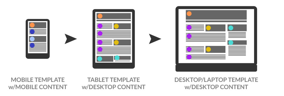
In the diagram below, you can see how the same content (represented by coloured dots) is being displayed to mobile, tablet and desktop but that the mobile template displays the content in a much narrower window.

Adaptive mobile site
If it's imperative that you're able to deliver different content to your mobile site but also wish to share much of the content on your desktop site, a separate, 'adaptive' mobile site can be setup on a subdomain (eg. mobi.domain.com) with a shared database. This makes publishing new content to both sites a very simple process.
Drawbacks for an adaptive mobile site include the extra workload of copywriting and user experience design for two sites and the increased costs in setup and templating. An adaptive site often uses responsive design templates for the desktop version of the site for viewing on a tablet device.
In the diagram below, you can see how the different content (represented by different coloured dots) is being displayed to mobile compared with the tablet and desktop versions. The tablet and desktop versions differ in the layout of the same content. Content can be displayed to both sites, as represented by the orange dot.

Mobile apps
Mobile apps stand apart from responsive design and separate mobile sites in that they have a much more developed relationship with the phone's operating system and hardware functions.
Eg. Where websites rely on a phone's proximity to a phone tower to determine a location, and a desktop computer relies on the local ISP exchange, most phones have a much more accurate GPS locator to pinpoint the owner's location.
Mobile apps can be written in the phone's native programming language where it has best access to the phone's hardware, or they can be written in a third party program that compiles the developers app into the native programming languages of the chosen platforms.
Mobile apps therefore are better at geo location, push/alert notifications, storing data on the phone, and for some, working without an internet connection, but they have a much higher price tag.
So, which is best?
Choosing the right solution can be hard. The best thing to do is contact one of our representatives and we'll be able to help you make the right call.